
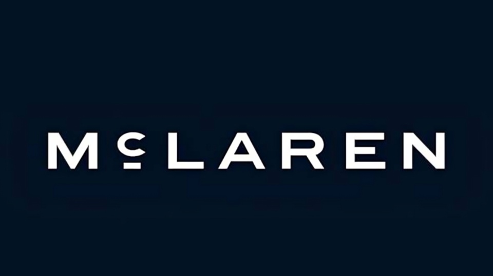
McLaren has introduced a new visual identity as the British automotive and motorsport company begins another phase of its development. The updated branding includes a redesigned McLaren wordmark inspired by the sign that once stood above the family-owned service station operated by Bruce McLaren’s parents in Remuera, Auckland, New Zealand.
The company describes the change as an evolved identity rather than a complete departure from its established branding. McLaren will continue to use several of the symbols that have been associated with the brand for decades, including the Speedmark, Speedy Kiwi and its distinctive Papaya colour. The new wordmark is intended to bring McLaren Automotive and McLaren Racing under a more connected visual identity.
The connection to Bruce McLaren is an important part of the new design. The family service station in Auckland played a significant role in his early interest in engineering and motorsport. It was at this location that Bruce McLaren worked on cars and developed the technical skills that later became central to his racing career.
The original garage signage has now been reinterpreted for the modern McLaren brand. The new wordmark uses a custom typeface called McLaren Sans. It has a cleaner and more contemporary appearance, with uppercase lettering and a distinctive horizontal line beneath the letter C. The design is based on the visual character of the original service station sign while being adapted for modern automotive, digital and racing applications.
McLaren has confirmed that the new wordmark will gradually be introduced across its businesses. This includes McLaren Automotive and McLaren Racing, as well as future production vehicles, merchandise and digital platforms. The objective is to create a more unified appearance across the different parts of the company.
The move is particularly significant because McLaren has maintained a recognisable visual identity for several decades. The Speedmark, which became a defining part of the McLaren brand from 1997, will continue to remain an important part of the company's identity. McLaren's own history of its logo shows how the brand has changed its visual design several times since the racing team was established in the 1960s.
The Speedy Kiwi will also remain part of the brand. The symbol has a direct connection to Bruce McLaren's New Zealand heritage and was introduced during an earlier stage of the company's racing history. Its continued use means the new wordmark does not remove the historical elements that have helped define McLaren over the years.
McLaren's Papaya colour will also remain a defining element of the brand. The distinctive orange shade has long been associated with McLaren's racing identity. Alongside Papaya, the company is introducing an expanded colour palette inspired by important moments and images from its history.
The expanded palette includes colours such as Ember, Midnight, Black, Anthracite, Colnbrook and Mist. McLaren says these colours were developed from historical references, including a photograph of Bruce McLaren. Midnight, a dark blue shade, is expected to have a stronger association with McLaren's road-car identity, while Papaya will continue to play an important role in racing.
The new identity has already appeared on the McL 6GT, a modern interpretation of Bruce McLaren's original M6GT road-car concept. The McL 6GT was presented as a link between the company's early road-car ambitions and its current design direction. It is also among the first products to display the new branding.
The branding update comes at an important stage for McLaren Automotive. The company has announced a £500 million investment programme to expand its engineering and manufacturing operations in the United Kingdom. The investment is intended to support future product development and the expansion of McLaren's manufacturing capabilities.
McLaren is also preparing to expand beyond its traditional focus on two-seat sports cars and supercars. The company has confirmed plans for a high-performance SUV, marking a significant expansion of its future product strategy. The new visual identity has therefore been introduced at a time when the company is preparing to enter additional areas of the automotive market.
The new branding also reflects McLaren's continuing motorsport activities. McLaren Racing currently competes across major racing categories, including Formula 1, IndyCar and the World Endurance Championship. The company has been highlighting its historical connection with Bruce McLaren while also preparing for future motorsport programmes.
McLaren's latest logo change is therefore more than a simple redesign of its name. The new wordmark takes a visual reference from the location where Bruce McLaren developed his early engineering interests, while the retained Speedmark, Speedy Kiwi and Papaya colour maintain continuity with the company's established identity.
The company says the evolved identity is designed to connect its past, present and future in one visual system. It will be introduced progressively rather than replacing every existing brand element immediately. Customers and fans are therefore expected to see the new wordmark appearing across vehicles, racing activities, merchandise and online platforms over time.
The new McLaren identity also comes as the company looks toward greater personalisation and broader customer experiences. McLaren says the updated branding is intended to support a wider expression of ownership and community as the company develops new products and expands its global presence.
Overall, McLaren's latest logo update combines historical references with a more contemporary design. The inspiration comes directly from Bruce McLaren's family service station in Auckland, while the continued use of the Speedmark, Speedy Kiwi and Papaya ensures that the company's established visual heritage remains part of the new identity.